
CASE STUDIES

Weight Loss
By Gina -
Tracking
Journal

the challenge

While working at Weight Loss By Gina, I was tasked with creating a physical tracking journal for clients who preferred handwritten notes throughout our 91-day weight loss program. This was one of the most common requests from our community, as many clients preferred a physical companion to the digital app. It also gave us the opportunity to create an officially licensed alternative to unlicensed journals already being sold on Amazon. Together, my supervisor and I identified the most valuable tracking features from the app and determined how to adapt them into a practical, elevated journal experience. From there, I led the layout design, illustration, and visual system for the journal, translating the program's digital experience into a physical product.
the process

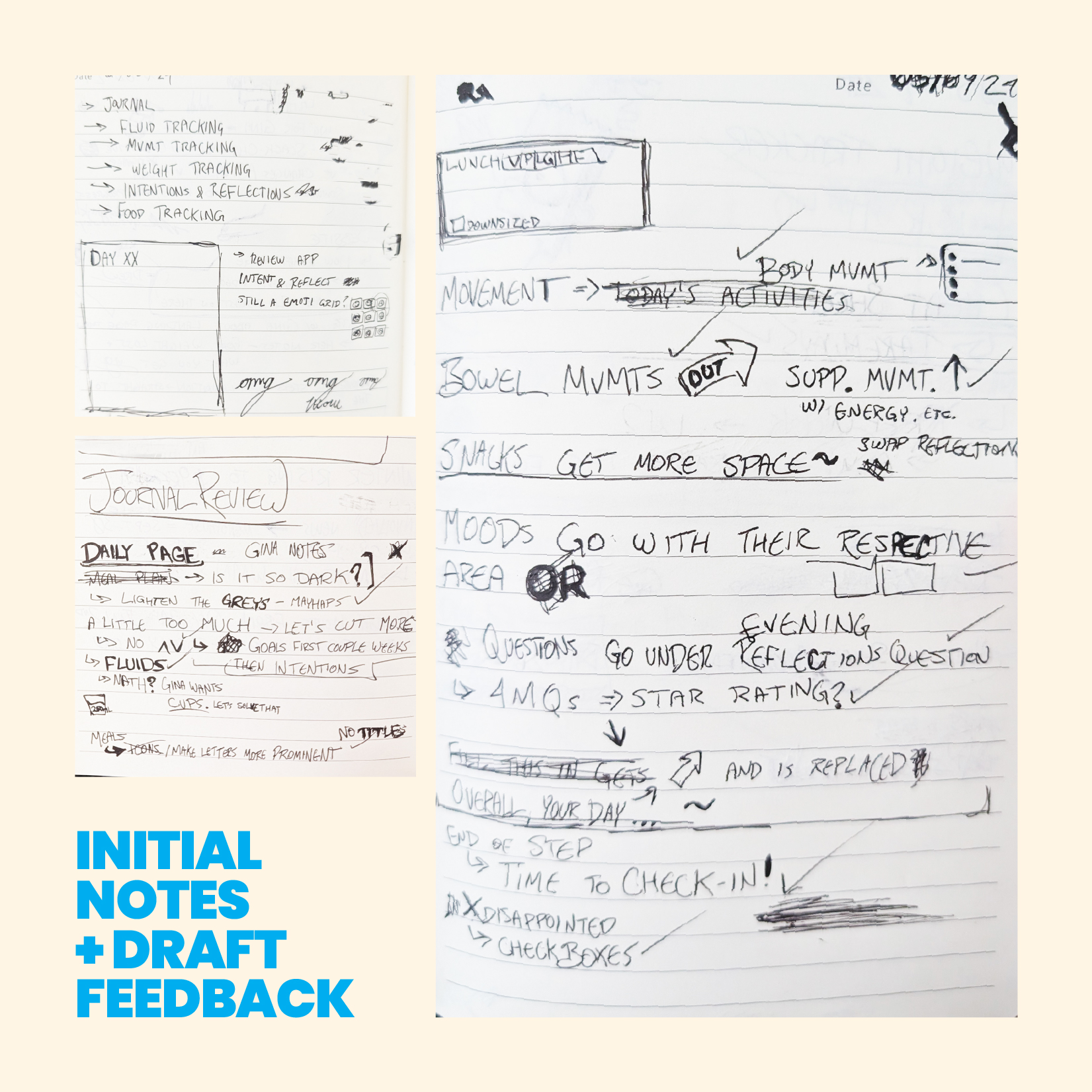
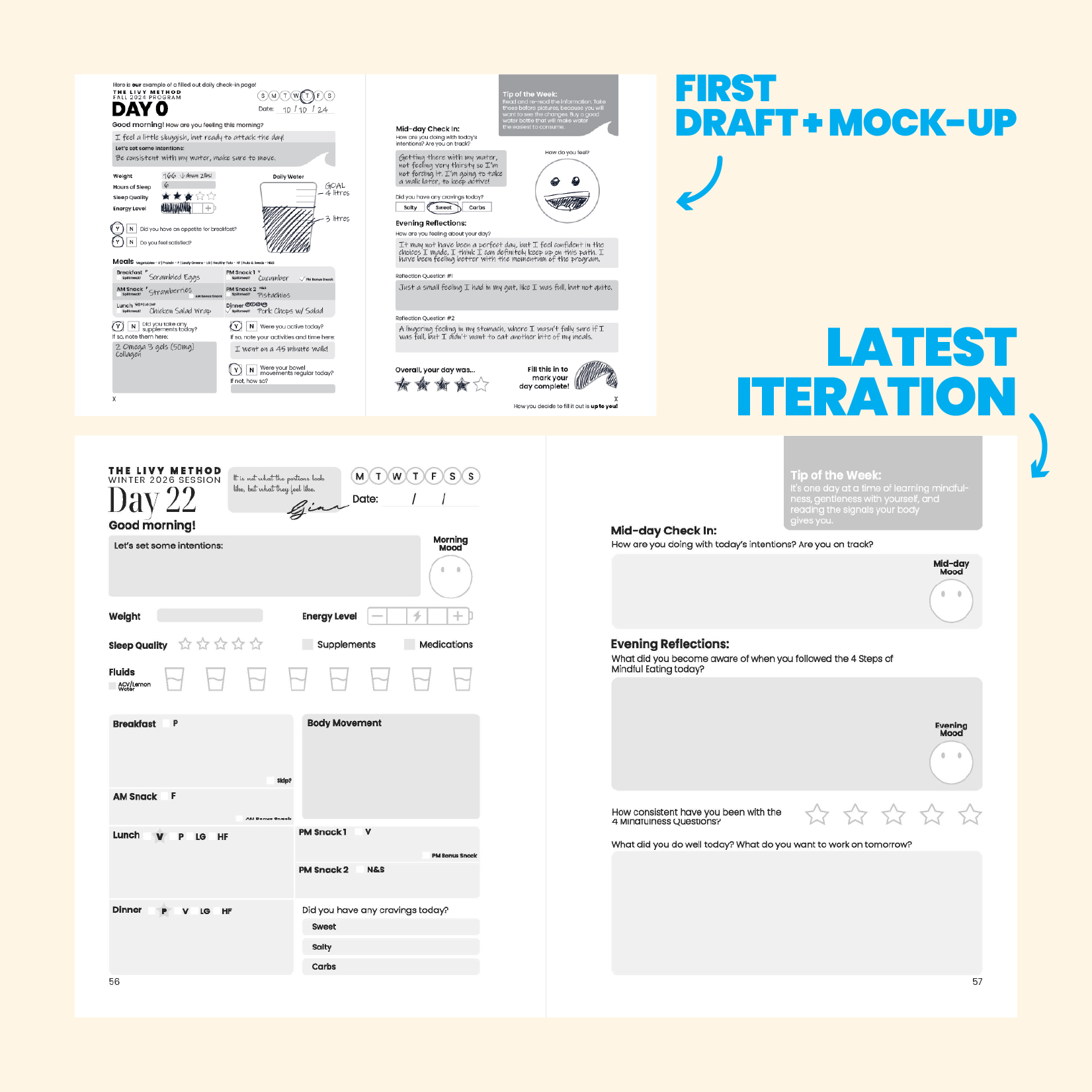
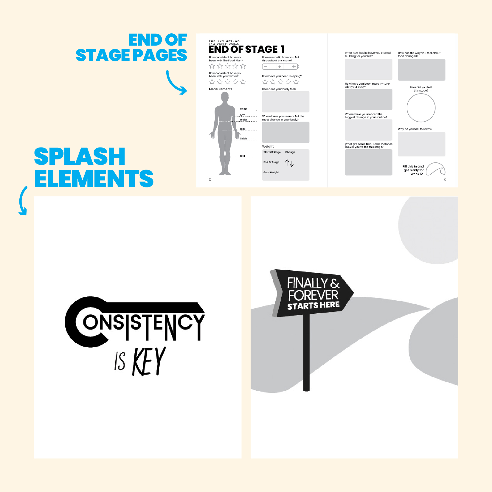
Using those requirements, I quickly developed drafts for the daily journal pages, focusing on creating an intuitive and engaging experience. I focused on making the journal intuitive and engaging by translating digital interactions into simple visual cues. Emoji-style mood icons, water cup trackers, and battery indicators helped users record information quickly without relying on lengthy written notes. Beyond the daily layouts, I also designed illustrations and milestone "splash" pages to celebrate key moments, including the completion of each four-week stage and the full 91-day program.

the results

The journals received overwhelmingly positive feedback, with each new cohort's edition refined through small improvements. Released for limited sales on Amazon, they frequently became top-selling titles on Amazon Canada alongside the Program Guide, which continues to be offered as an evergreen product. The first 4 journals maintained 4-star+ ratings through their release.

additional elements

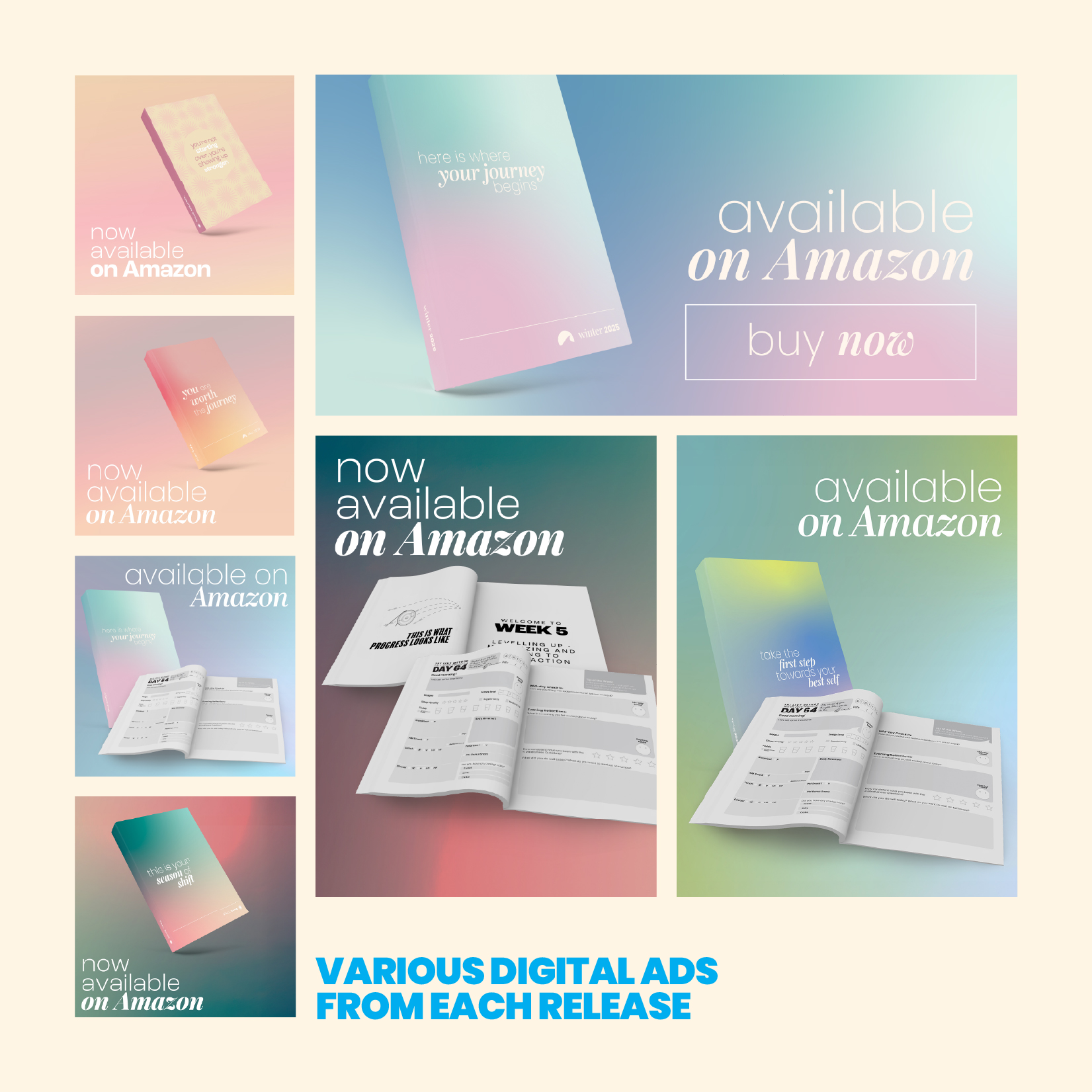
Alongside the journal interiors, I designed each cover and created the marketing assets for every release. This included in-app advertisements and social media campaigns across Facebook and Instagram. While each edition featured its own unique colour palette and cover design, the promotional materials maintained a consistent visual identity, allowing every release to feel like part of a cohesive series while still standing on its own.